Henry Pharmacy
- Solution
- Pharmacy
- Client
- Mister Henry
- Location
- Edegem
- Type
- B2C
- Surface
- 80
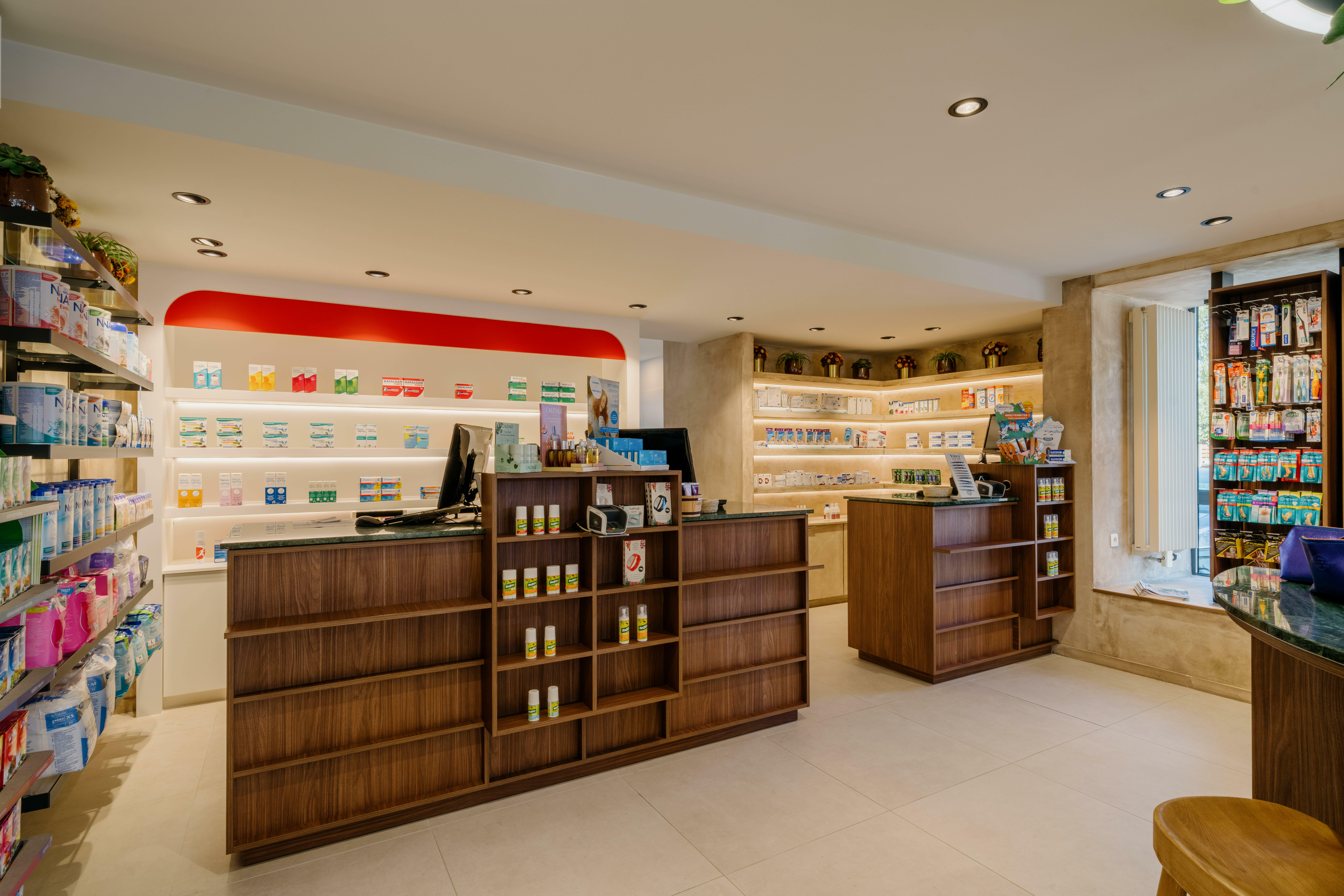
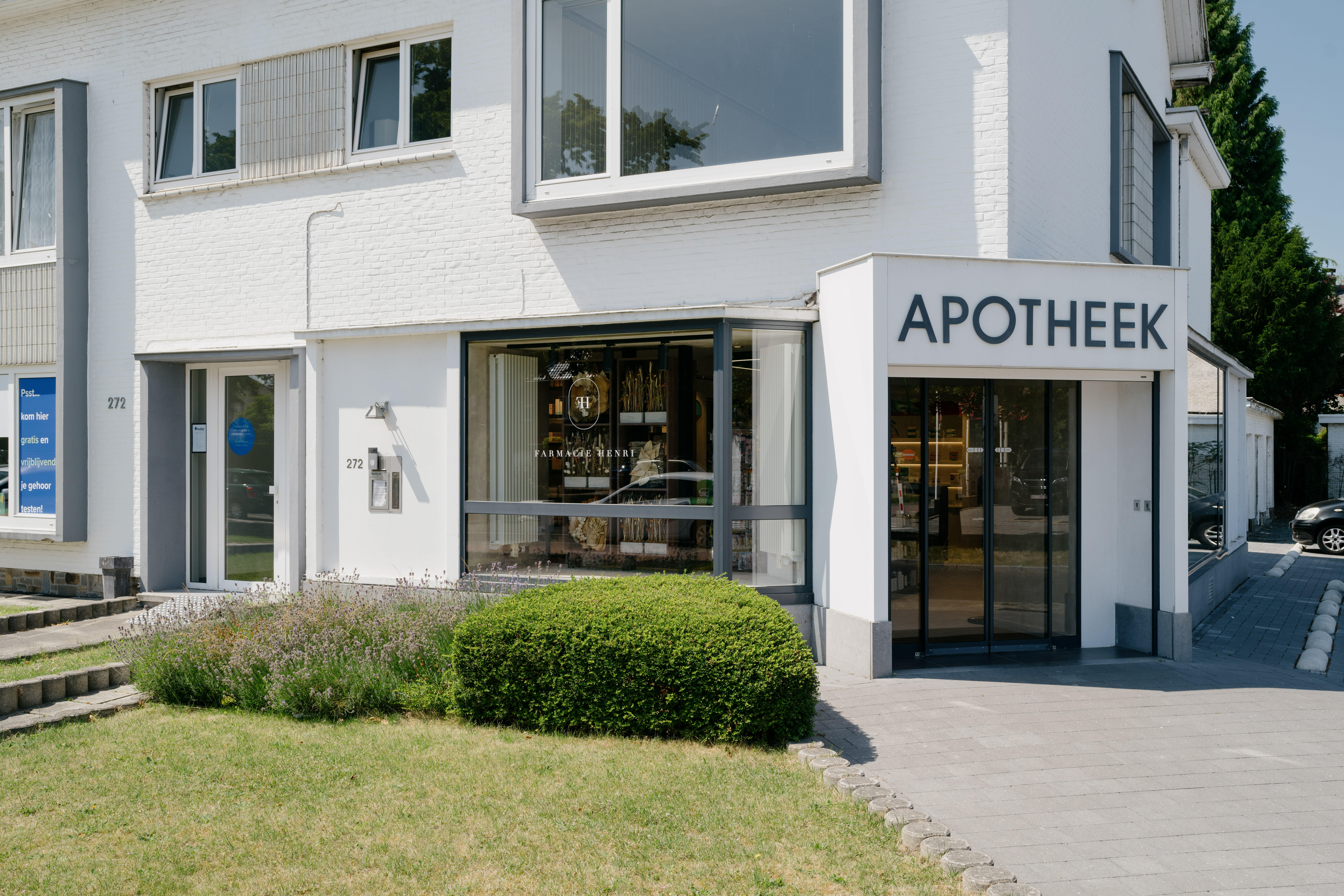
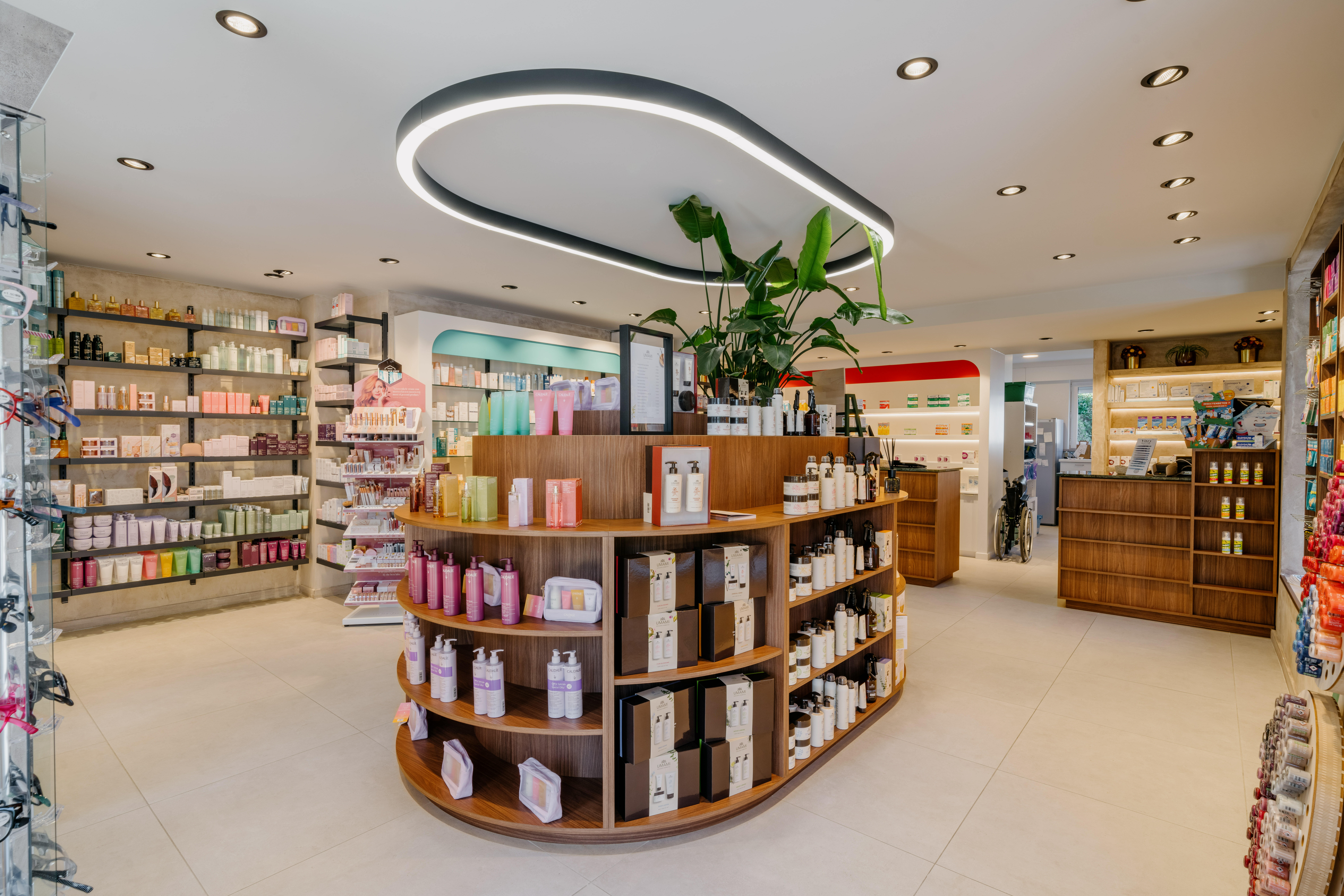
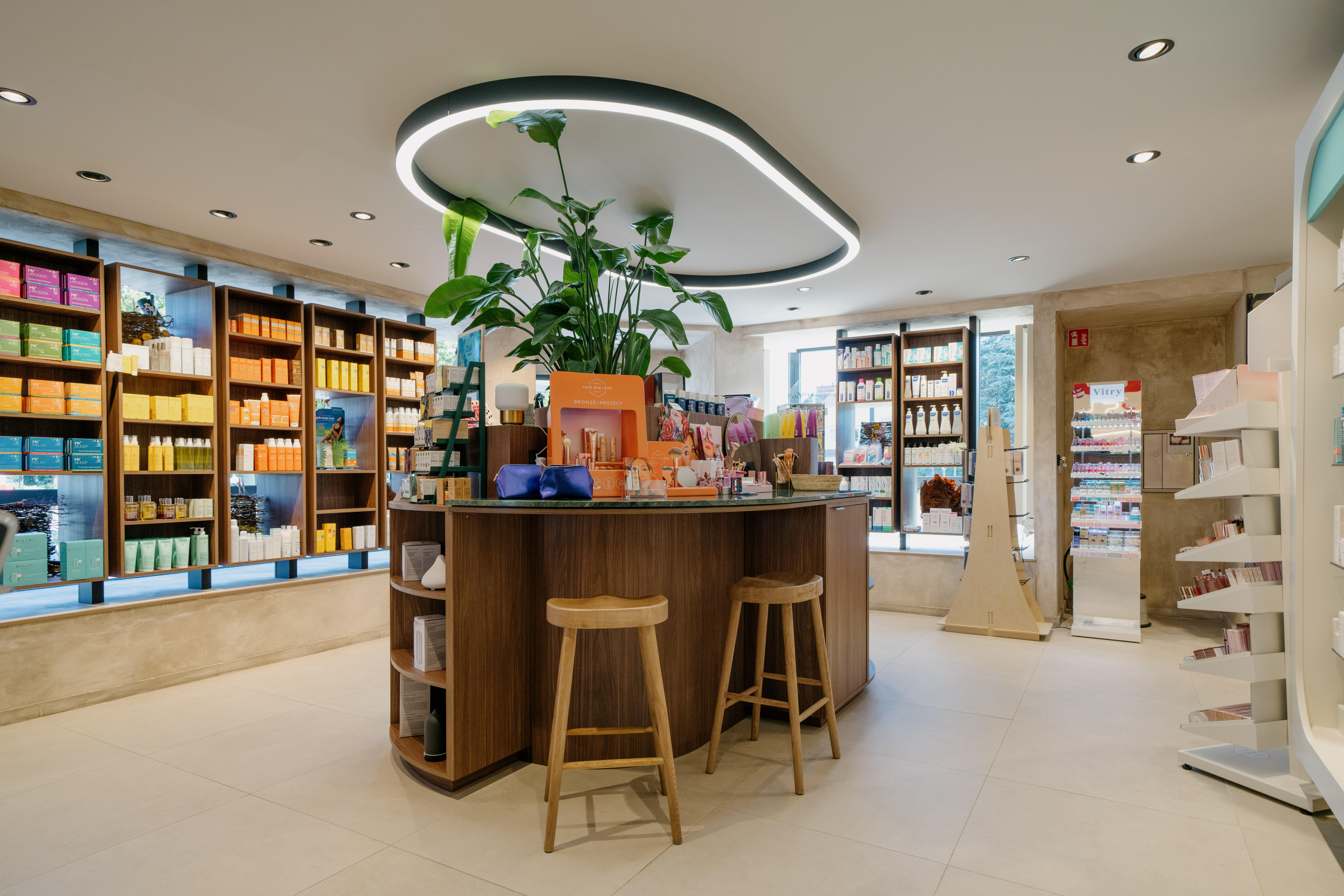
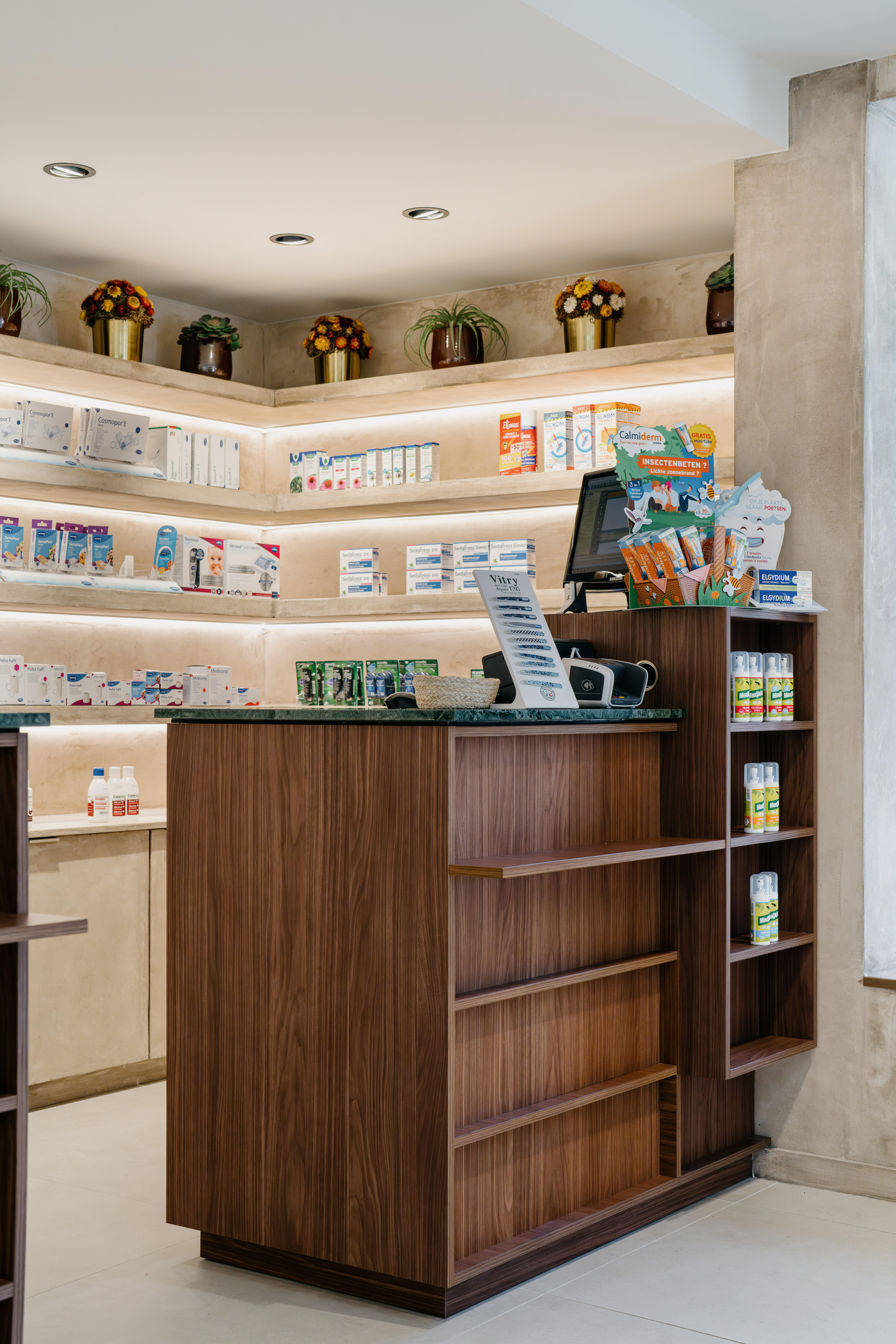
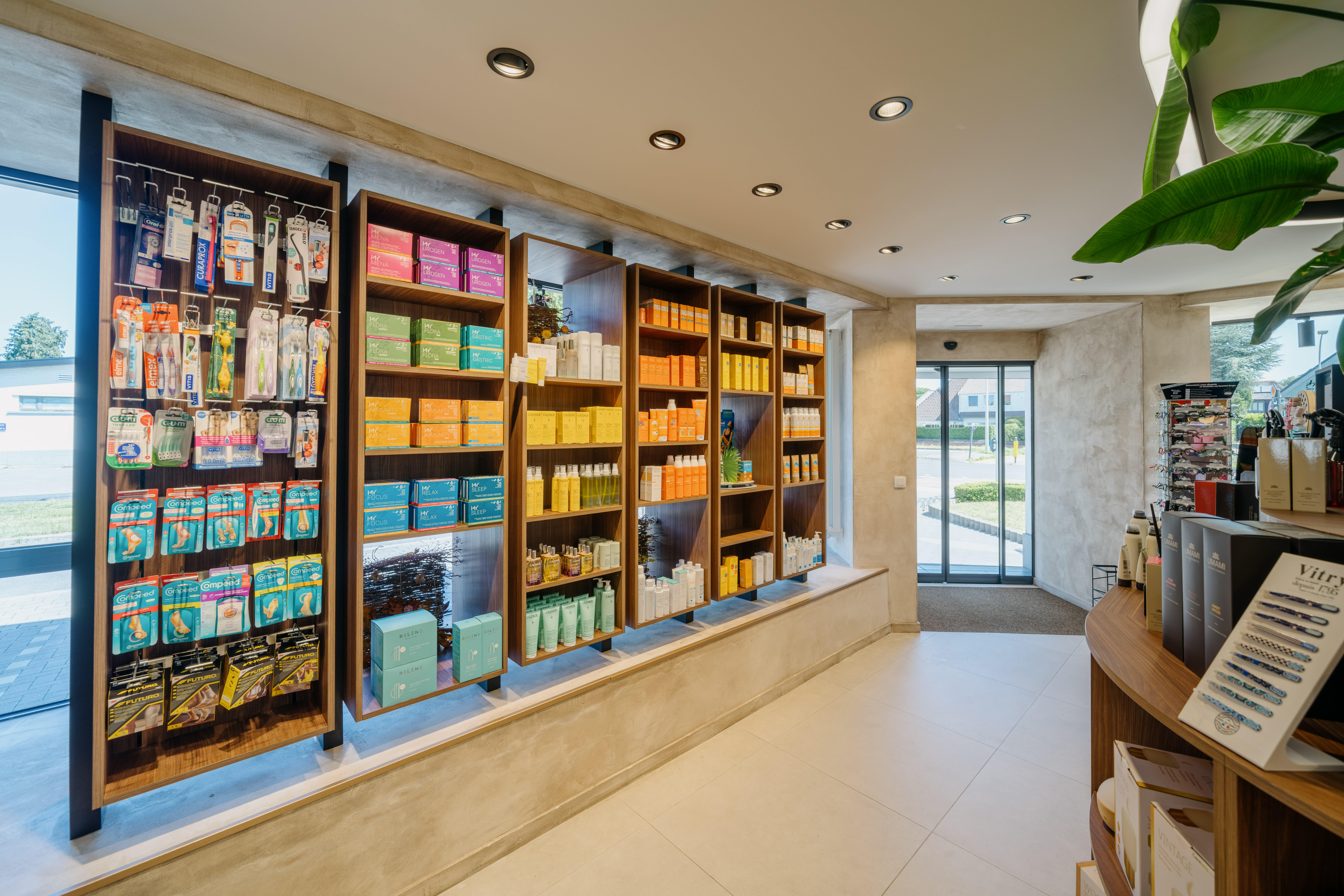
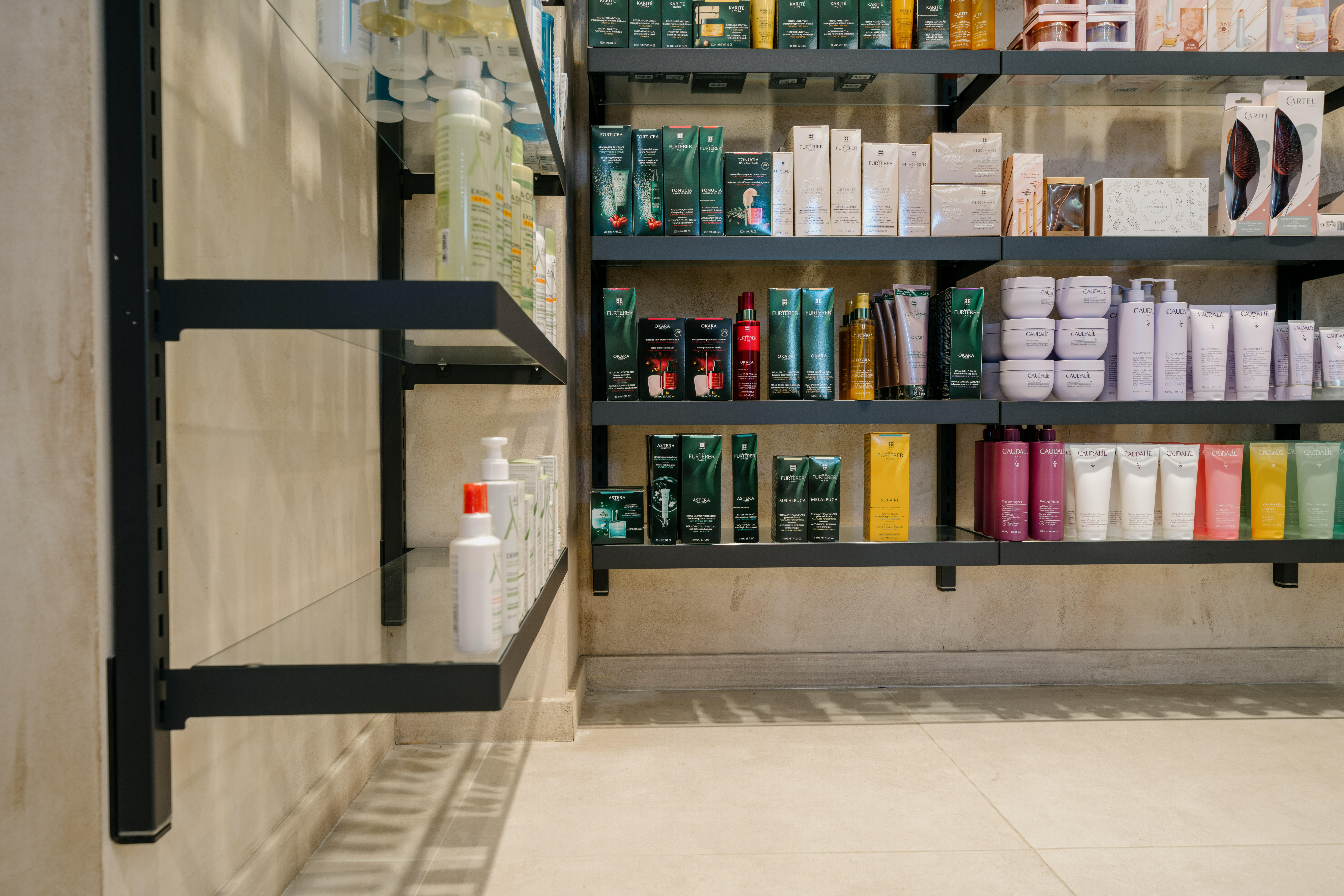
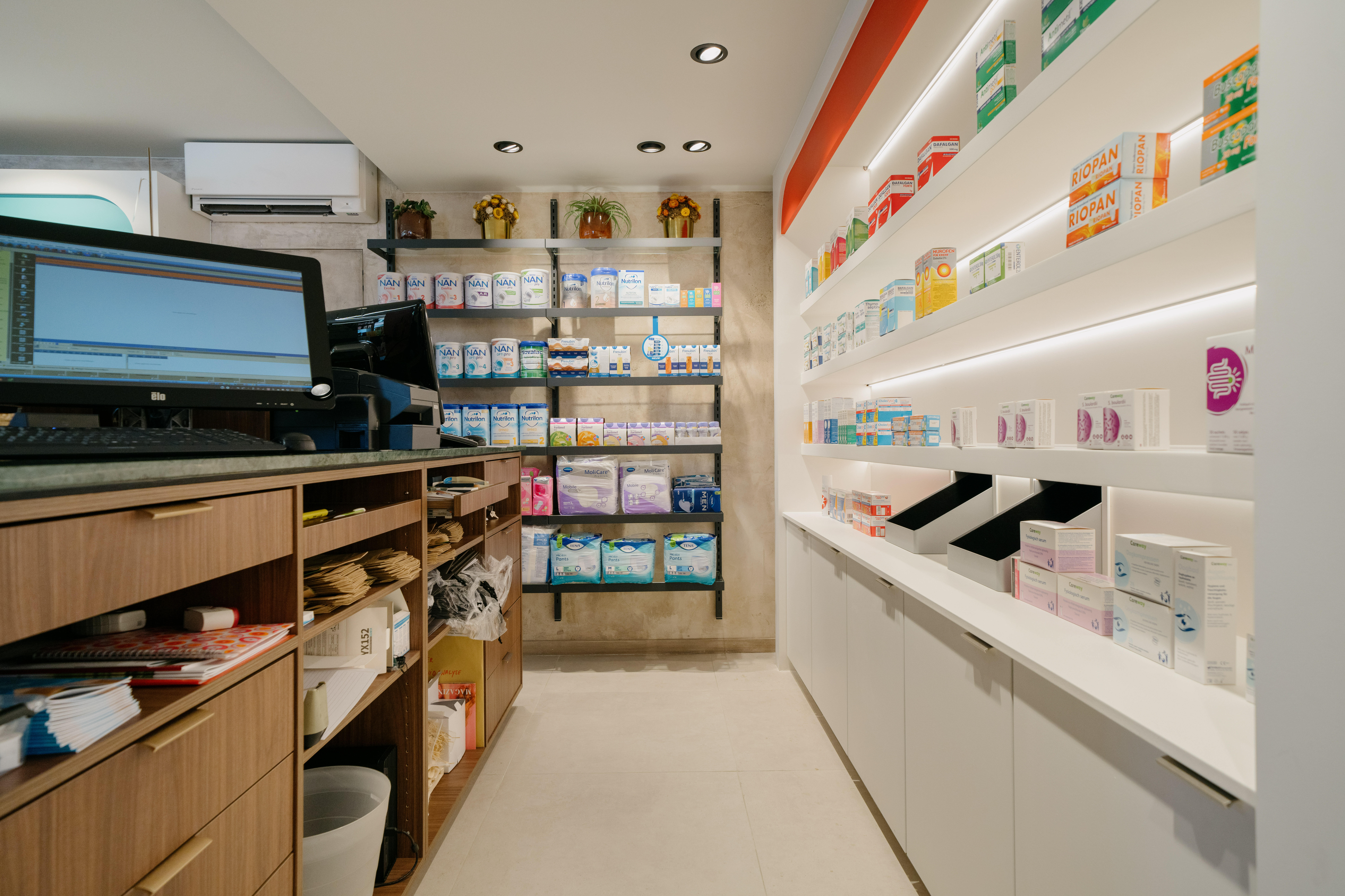
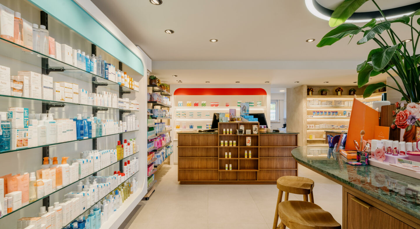
Renovation and Expansion of Henry Pharmacy in Edegem.
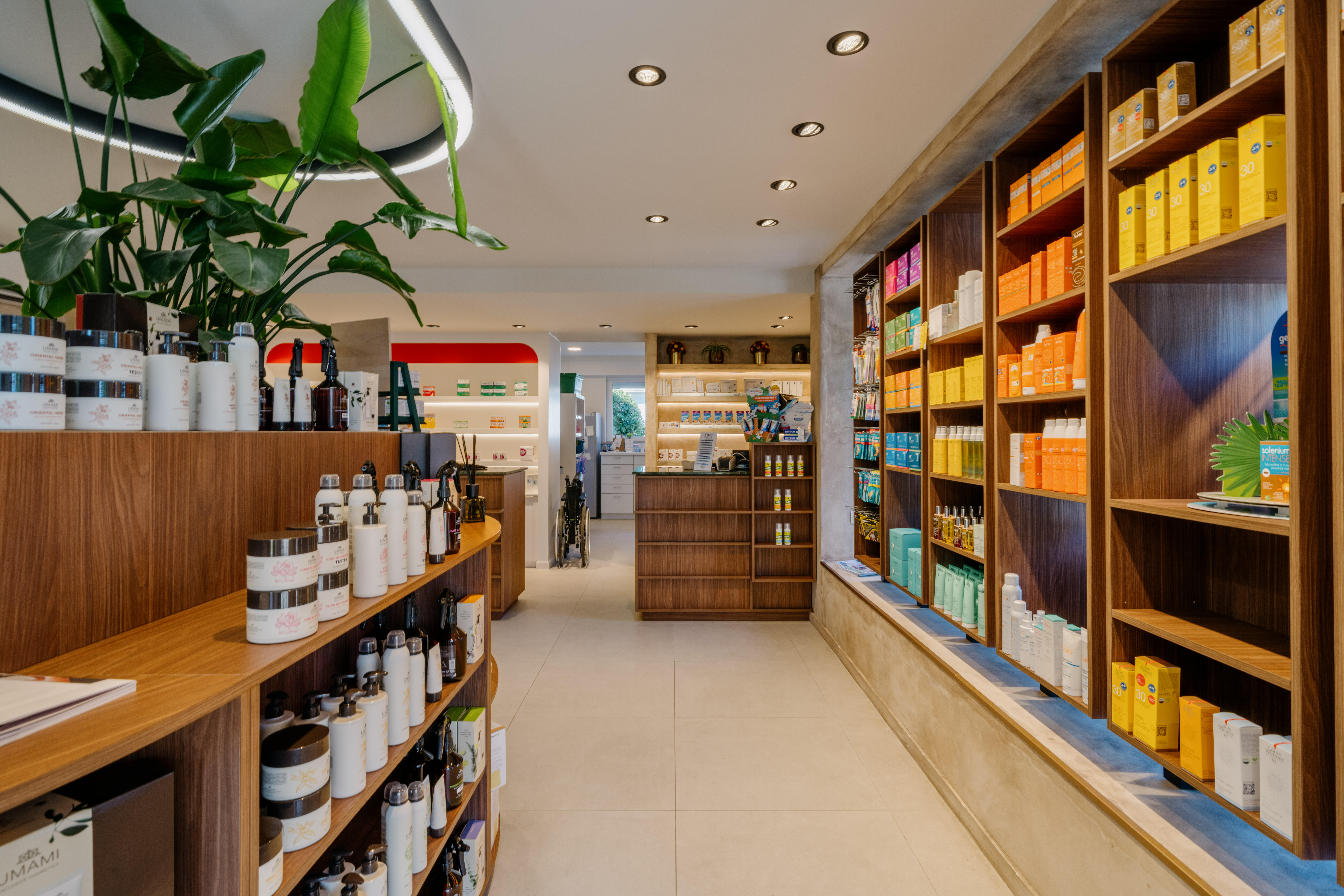
At the heart of its design, special attention has been paid to aesthetics.
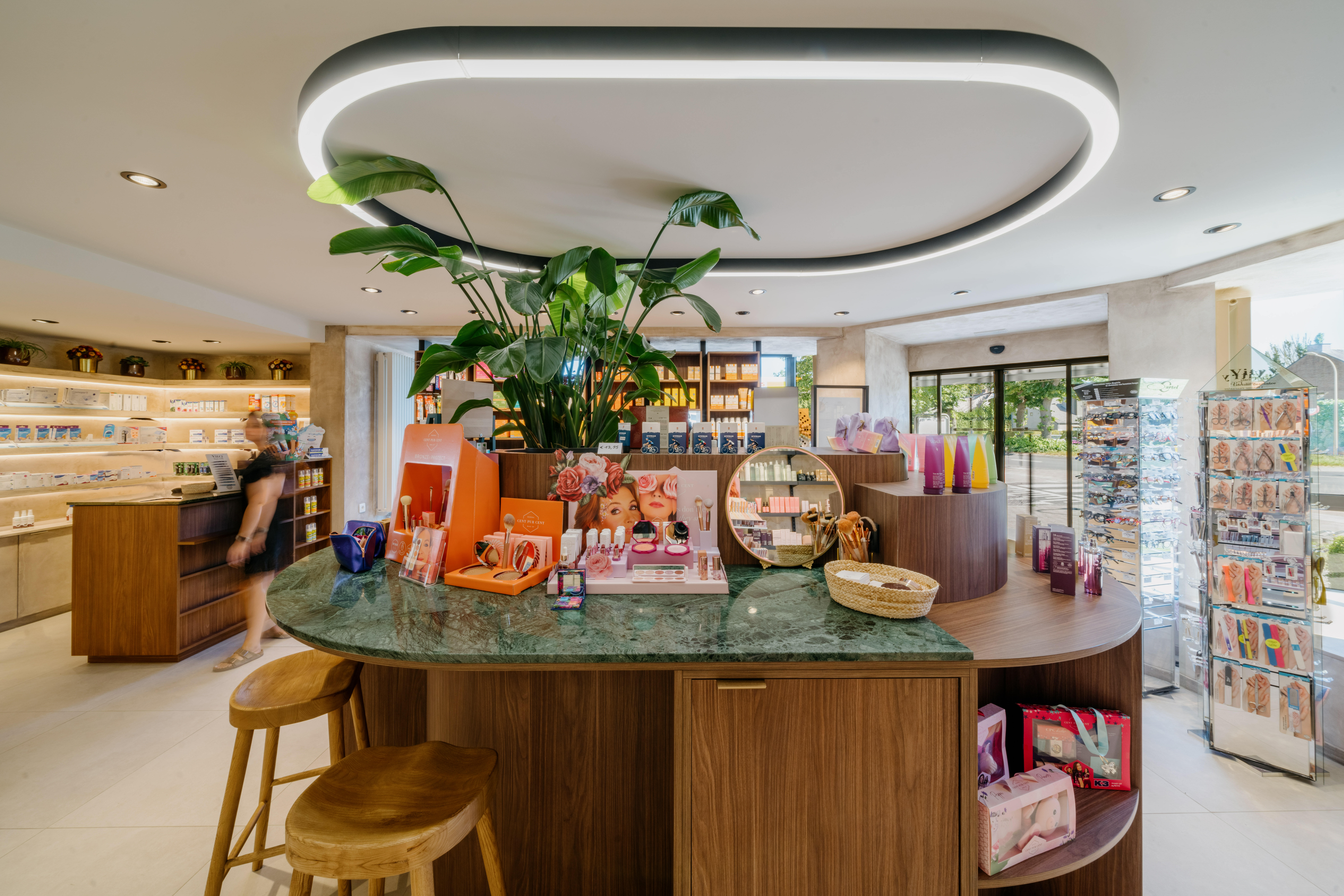
Every Choice, from Furniture to Materials, Including Lighting and Color Palette, has been carefully considered to create a soothing and inviting experience.
Key Points of attention:
- Counters and the central gondola combining functionality and design.
- The product testing bar offering a meeting place and adding a new dimension to the patient experience.
- The claustra system (wooden slats) to take advantage of natural light, create a warm atmosphere, and highlight the products and the pharmacy.
- Integration of a robot.
