Guillaume pharmacy
- Solution
- Pharmacy
- Client
- Michel Guillaume
- Location
- Thuin
- Type
- B2C
- Surface
- 170 m²
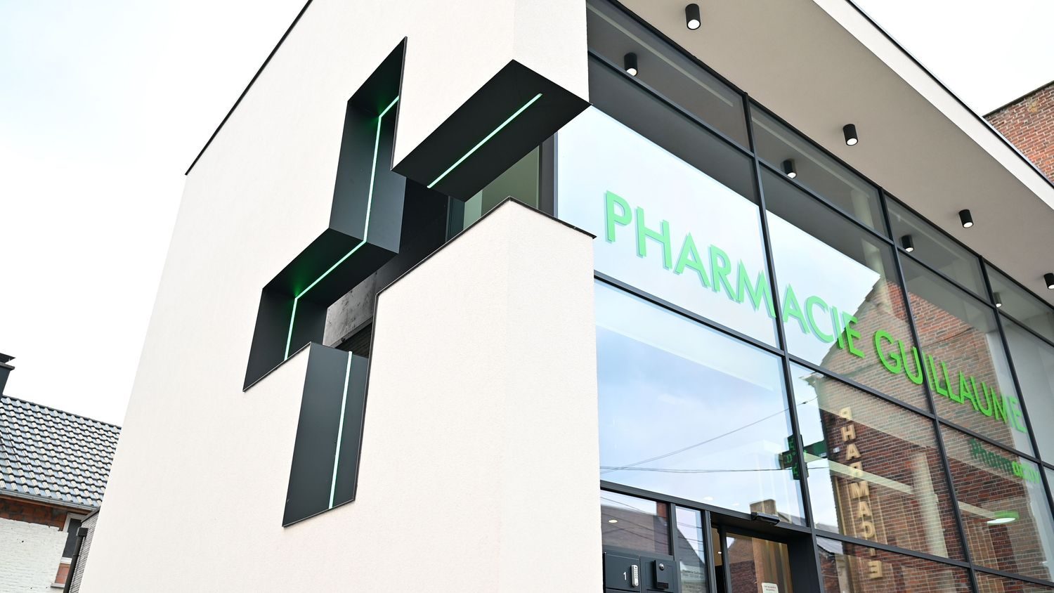
Located on a busy thoroughfare, Mr. Guillaume's pharmacy benefited from a good location. The opportunity to build a brand new building on the land adjacent to his pharmacy offered him a unique opportunity to give his pharmacy greater visibility, space and comfort.
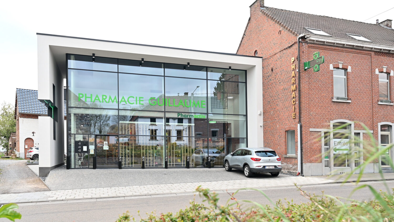
Mr. Guillaume talks about the changes that have taken place since the transformation...
I'd say it's like comparing night and day... completely different from before!
I'm going from 12 m² to 125 m² of self-service access.
Thanks to the pharmacy's higher profile, we're attracting a lot of new customers and building up their loyalty.
Thanks to the space available, many new ranges have been introduced into my assortment. All these new and well promoted products generate a lot of interest and have a major influence on the shopping basket.
It's worth noting that our patients appreciate it when we help them with self-service access. I believe that proximity without a counter creates social links.
A profitable investment
As far as I'm concerned, the total cost of PLUO paid for itself in less than 36 months. Then there are the tax savings from the investment...
My sliding door is wide open to anyone who would like to visit my pharmacy and/or share in my experience of this wonderful adventure!
key_figures
- +20% customer numbers
- +26% gross margin
- +24% Products at 21% VAT
"From the planning stage right through to final delivery, I was surrounded by a team of professionals that I would highly recommend..."
What were our involvement and challenges in this project?
The project is the result of an excellent collaboration with Mr. Guillaume and his architect.
Mr. Guillaume had a very clear vision of his future pharmacy. He wanted a brightly-lit space with a contemporary, clean and warm style, offering a serene atmosphere.
Image Gallery
Our architect-designers have tried not to alter the architectural project imagined by his architect: a building and a space that are resolutely modern, bright and open to the outside world.
With the exception of the structural work, our teams handled the entire furnishing project for the pharmacy: design of the concept, production of the furniture, finishing, electricity, painting and installation of the furniture.
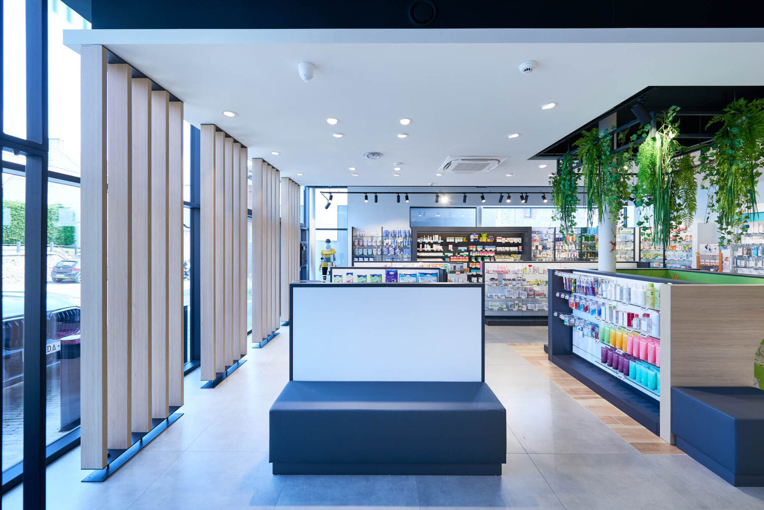
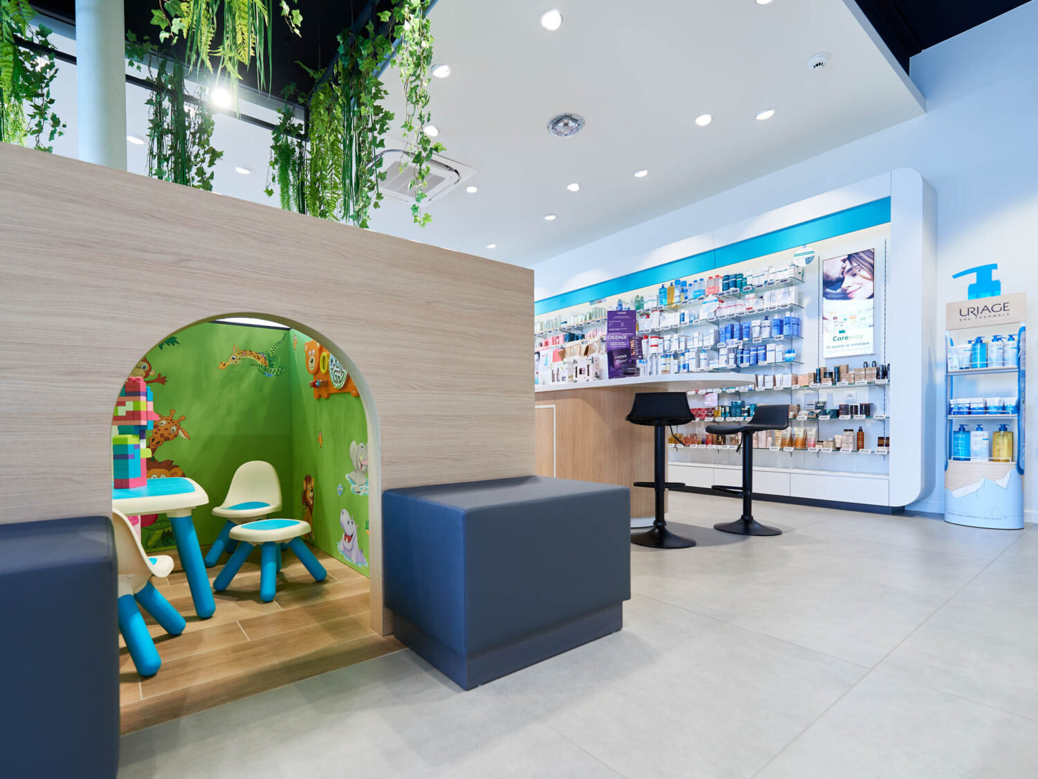
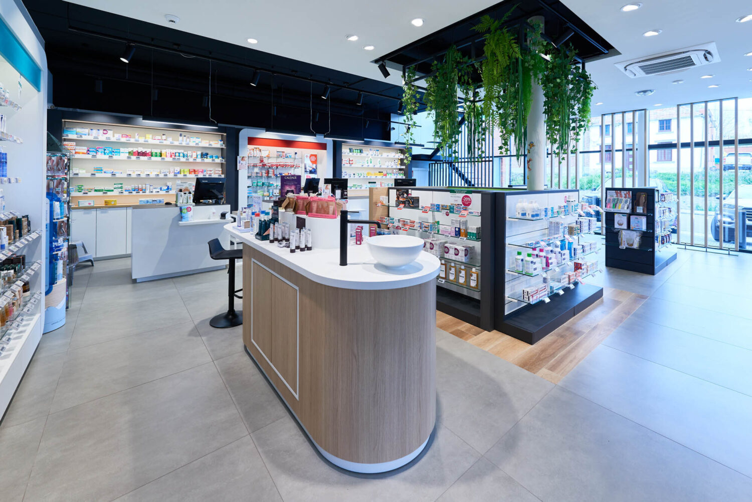
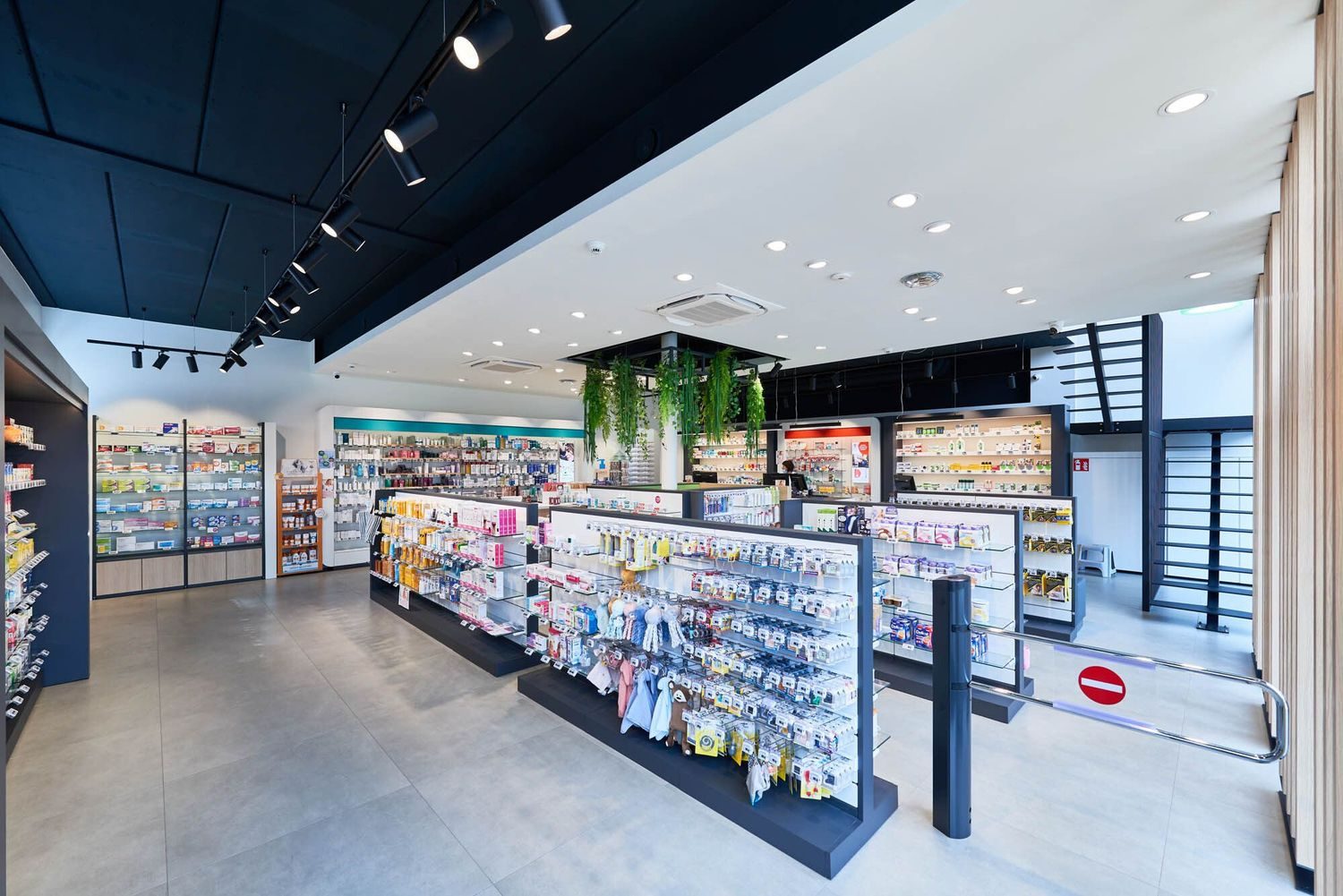
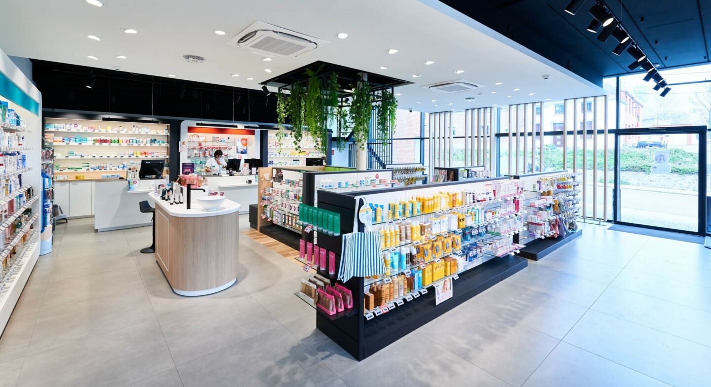
The floor-to-ceiling glazing on the street side of the pharmacy provides magnificent light and excellent visibility. A system of claustras (wooden slats) installed along the length of the window brightens the interior with natural light and accentuates the feeling of space.
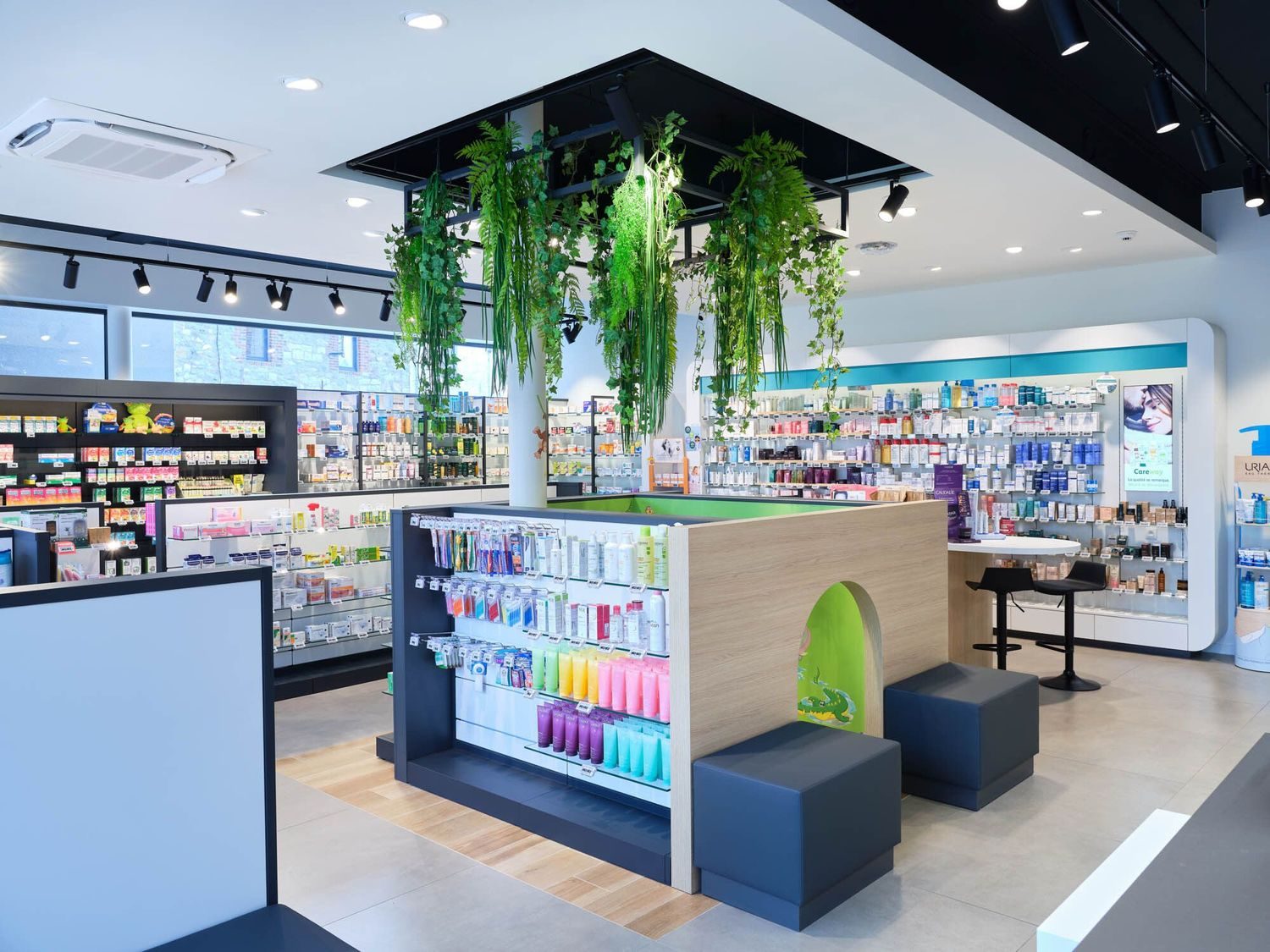
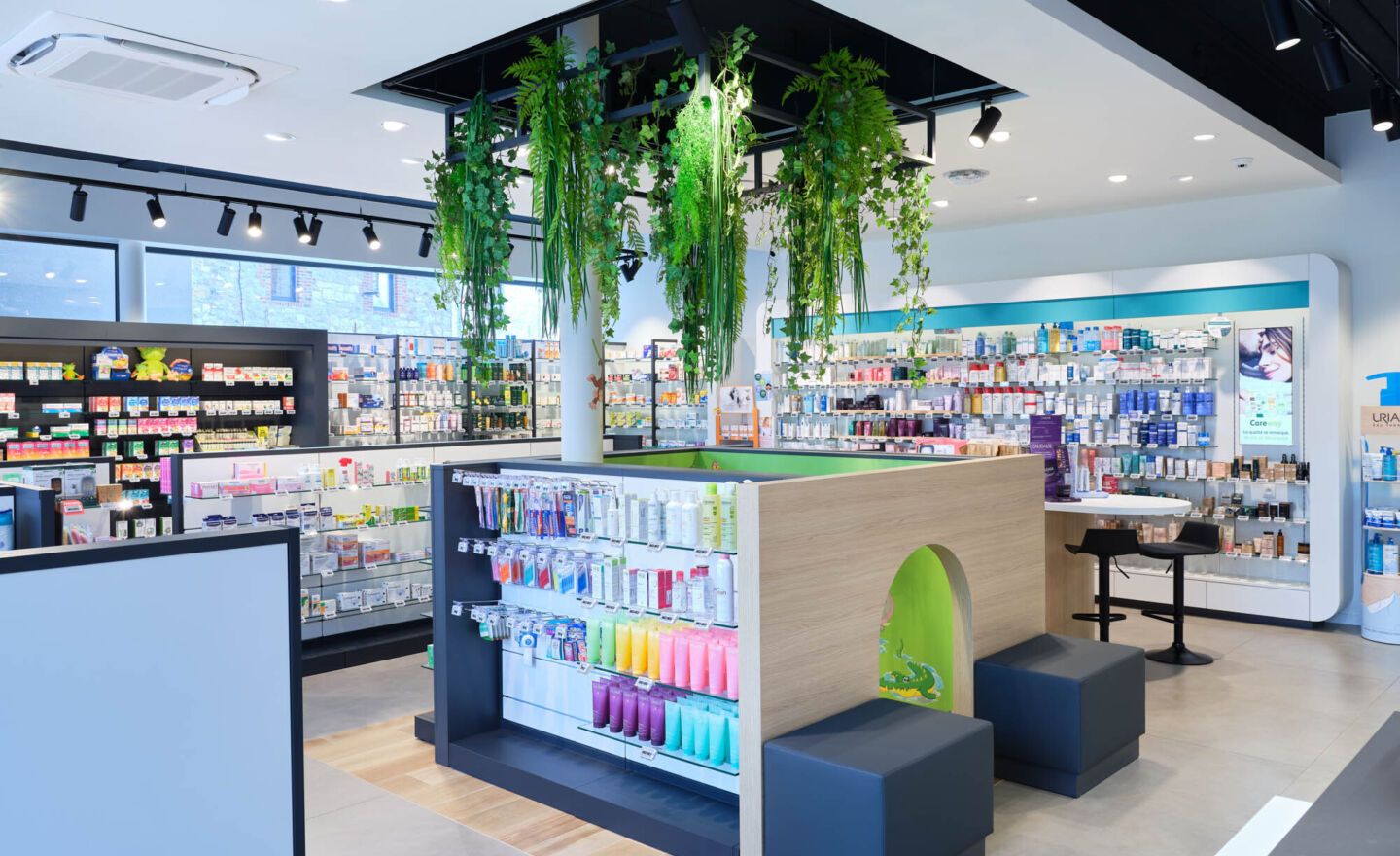
Contemporary, uncluttered, warm atmosphere and flowing route
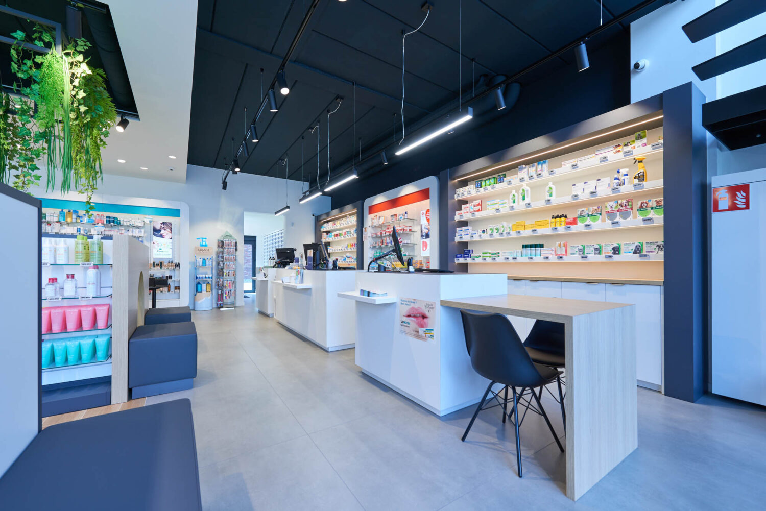
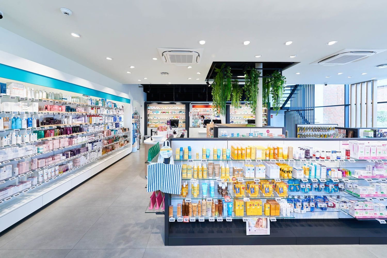
The layout has resulted in a fluid customer pathway where patients feel free, even though they have to pass through the various predefined zones.
The creation of this atmosphere, which is very important to Mr. Guillaume, was achieved through the layout, the choice of materials, their shapes and colours.
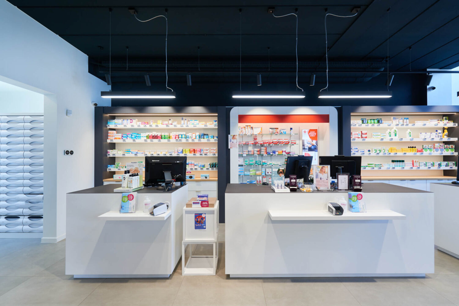
Our architects have chosen to combine industrial and cosy styles. The technical ceiling has been left exposed and painted black. A white suspended ceiling creates a warm, luminous look.
Image Gallery
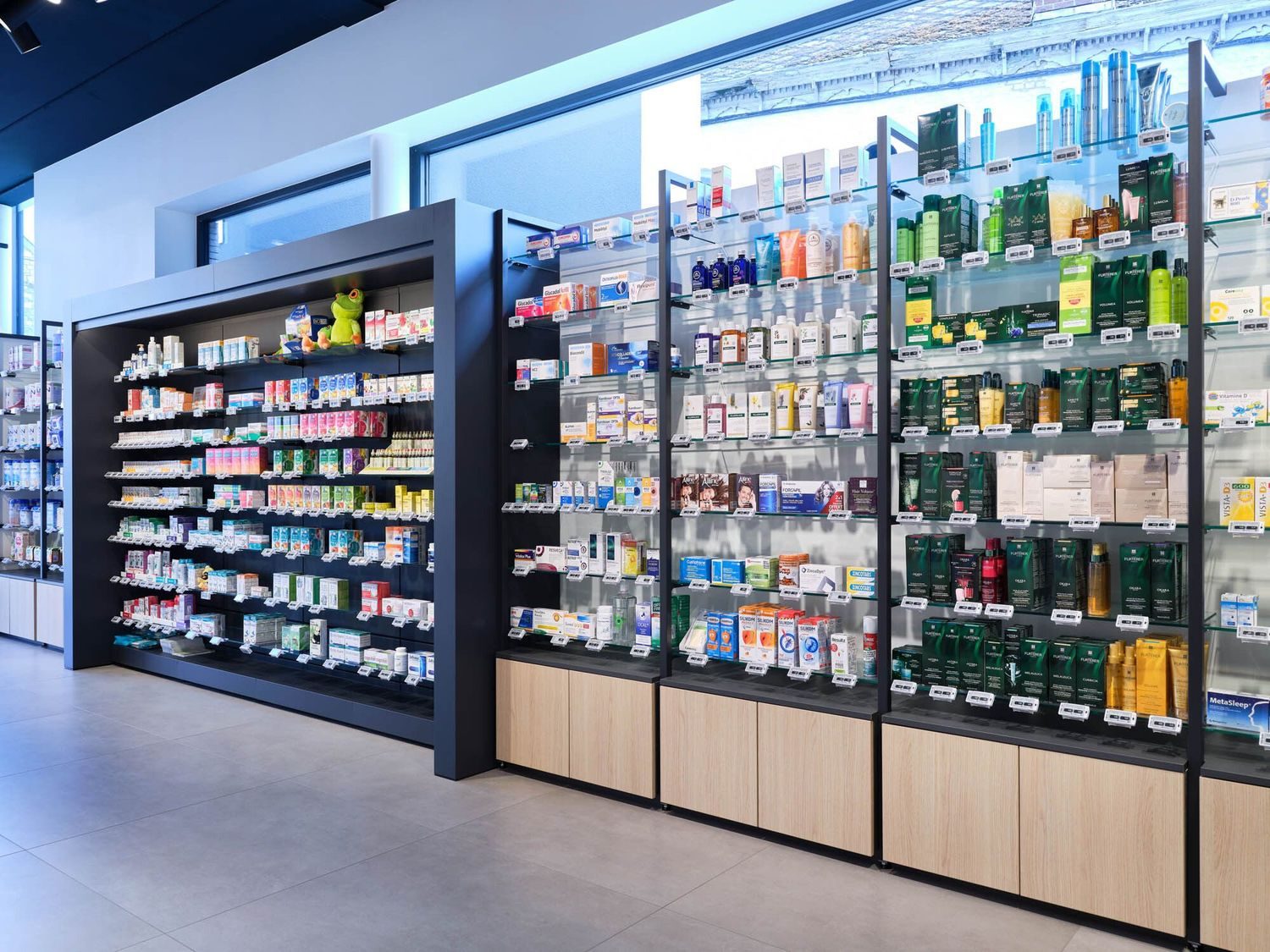
As for the furniture, we worked with a mix of dark metal furniture and light and white wood furniture.
The absence of signs to define the zones is a deliberate choice on the part of Mr. Guillaume to preserve the clean lines.
As the Guillaume pharmacy is a member of the Pharmactiv group, our architects had to take account of their graphic charter when choosing the colours.
Image Gallery
Our heartfelt thanks go to Mr. Guillaume and his architect for their trust, inclusion and collaboration throughout the project.
